Author’s compilation on Modularity or Ornamentation
July 11, 2020
Por admin
0
001
TRUCHET TILES
SEBASTIEN TRUCHET, FRANCIA [1657-1729]
Conocido como el padre Sébastian, era un sacerdote dominico francés nacido en Lyon, que vivió bajo el reinado de Luis XIV. Estuvo activo en áreas como matemáticas, hidráulica, gráficos, tipografía y para muchos inventos.
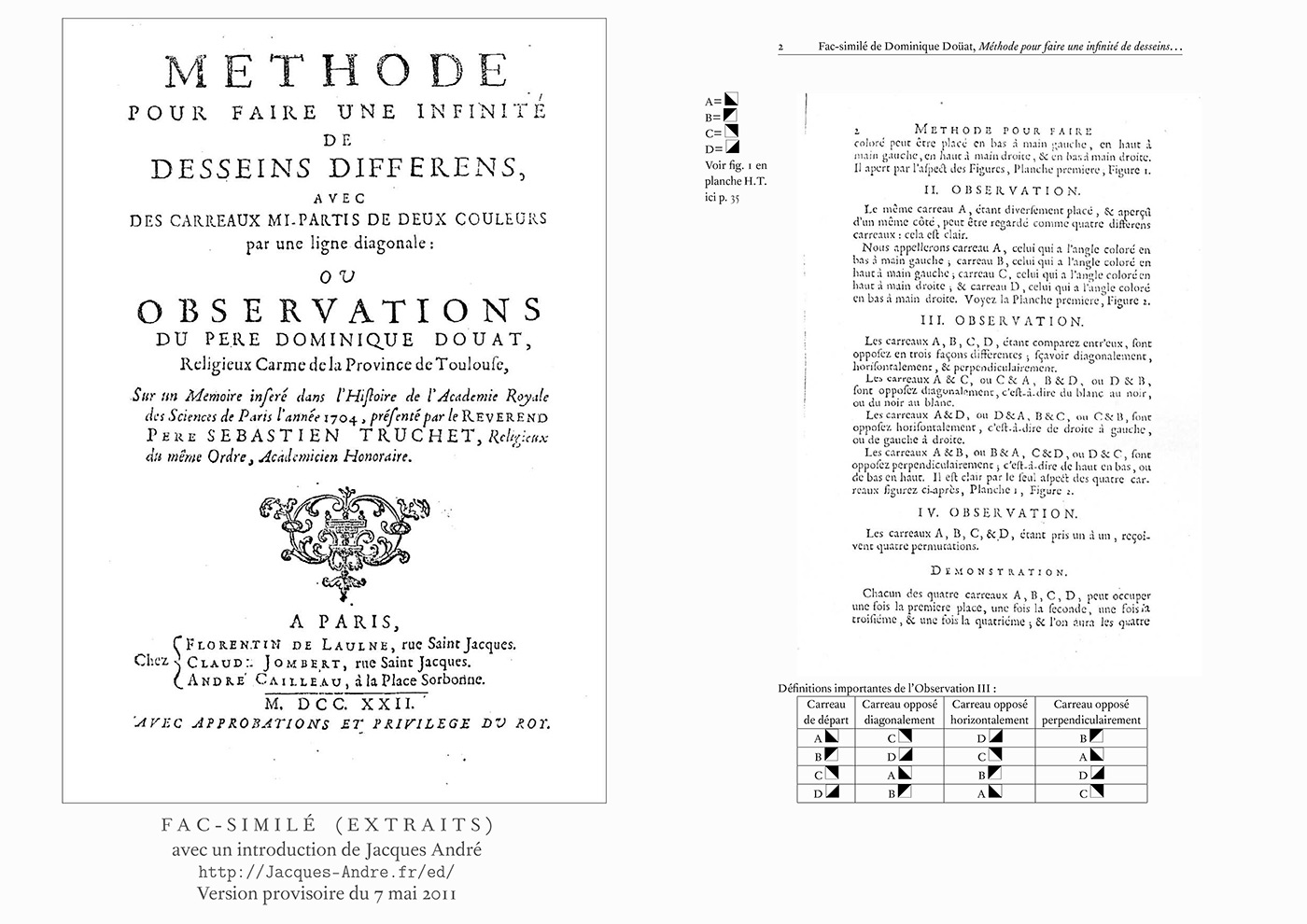
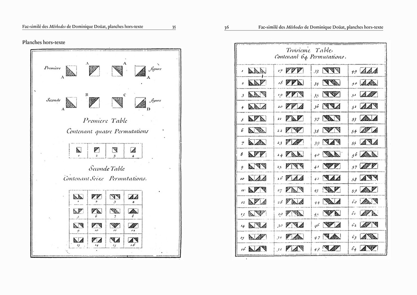
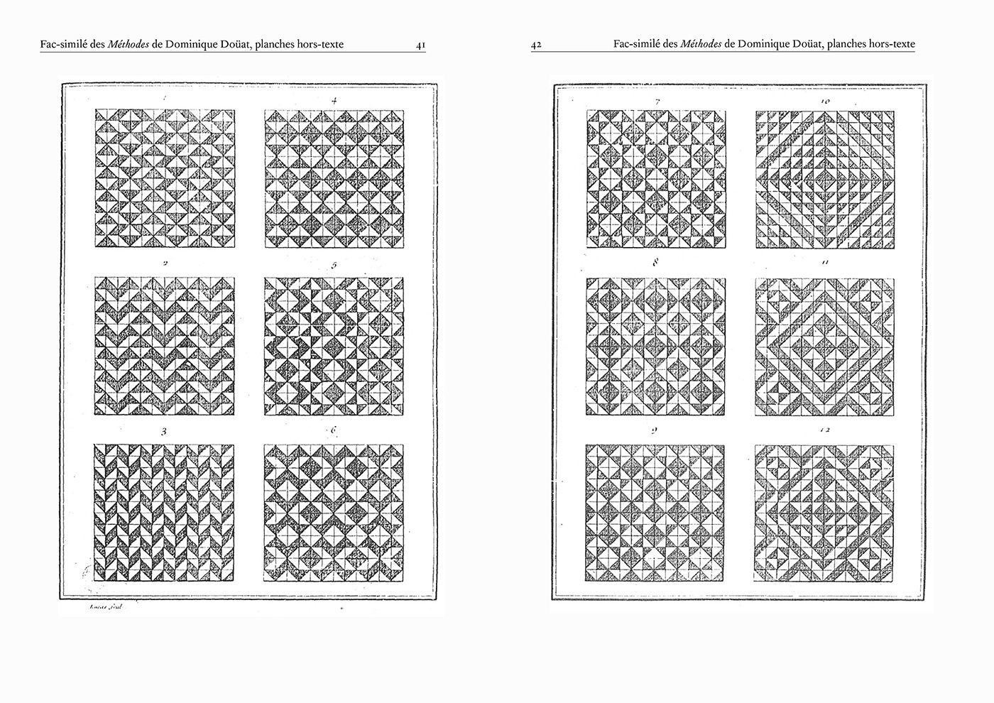
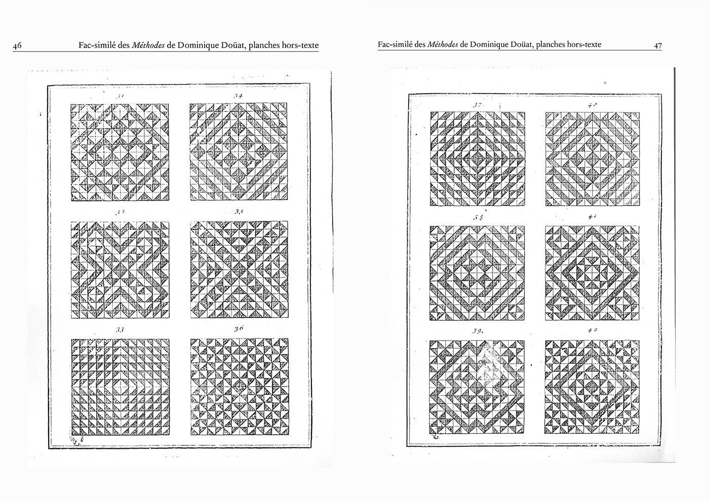
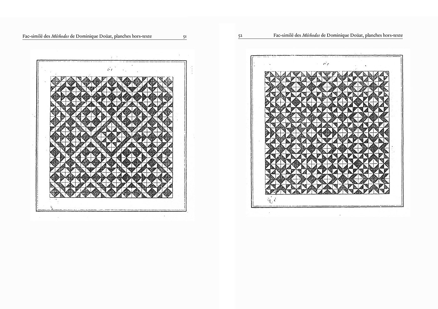
Truchet estudió patrones decorativos en baldosas de cerámica. Un patrón particular que estudió involucró mosaicos cuadrados divididos por una línea diagonal en dos triángulos, decorados con colores contrastantes. Al colocar estos mosaicos en diferentes orientaciones entre sí, como parte de un mosaico cuadrado , Truchet observó que se podían formar muchos patrones diferentes.
Este modelo de formación de patrones fue adoptado más tarde por Fournier, y ahora los matemáticos y diseñadores lo conocen como mosaico de Truchet. (Wikipedia)
En los enlaces de la derecha podrán encontrar algunos artículos con investigaciones que nacen a partir del análisis de Truchet Tiles aplicados a retículas de otros tamaños. Las posibilidades de combinación son infinitas. Así mismo, encontrarán un enlace hacia mis propias exploraciones. Sébastien Truchet. Typeface and modular specimen.
ENLACES

002
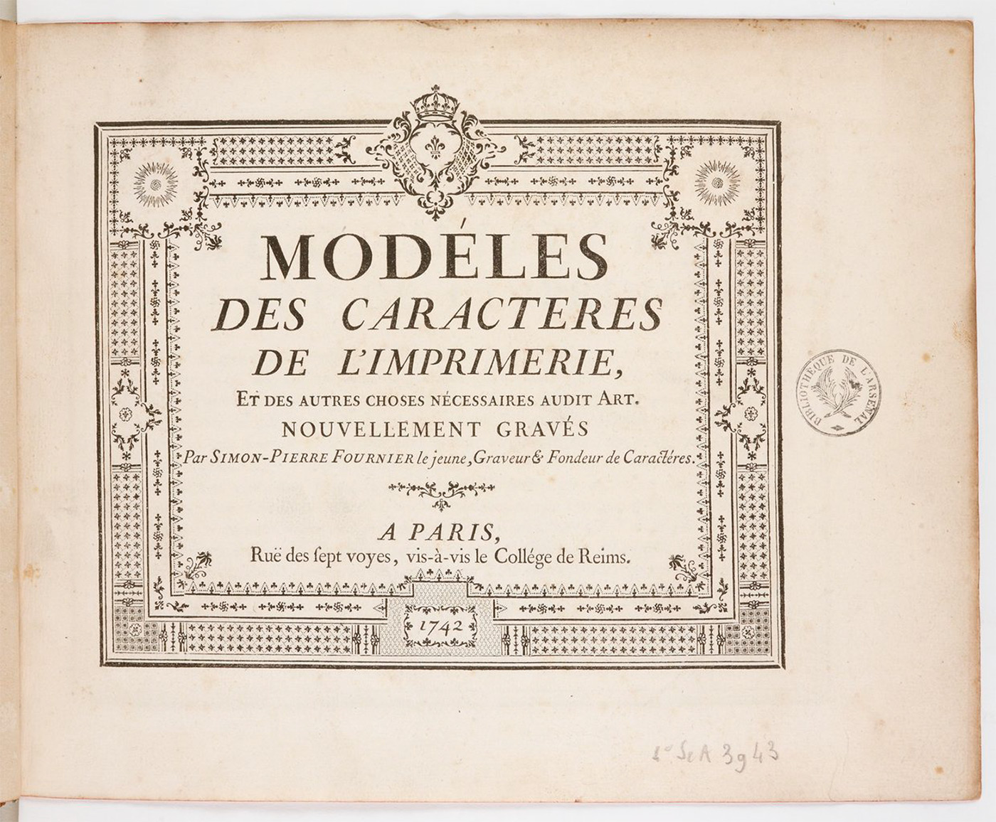
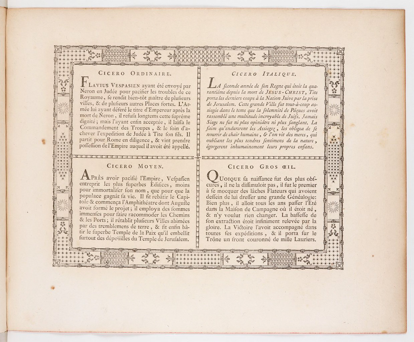
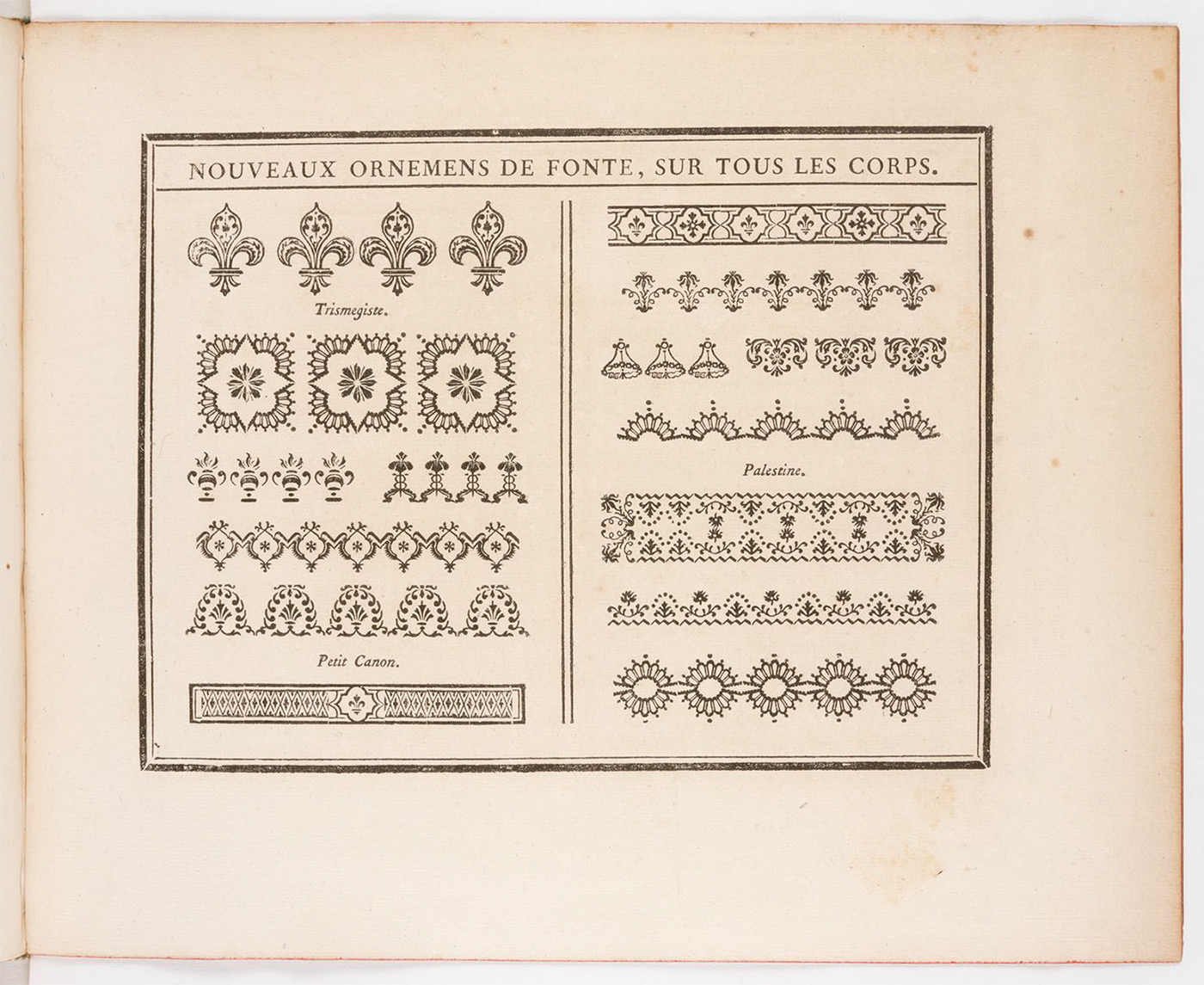
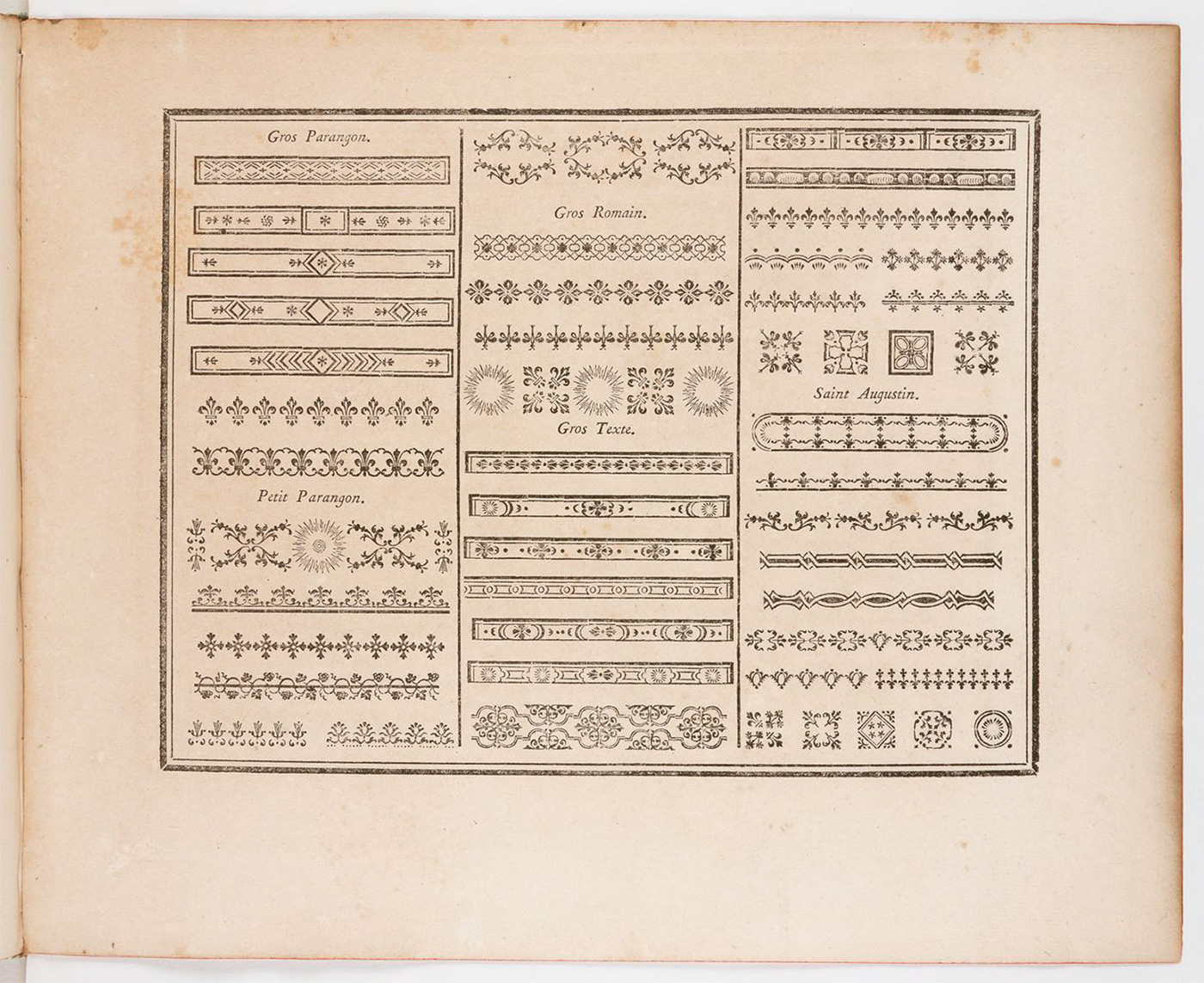
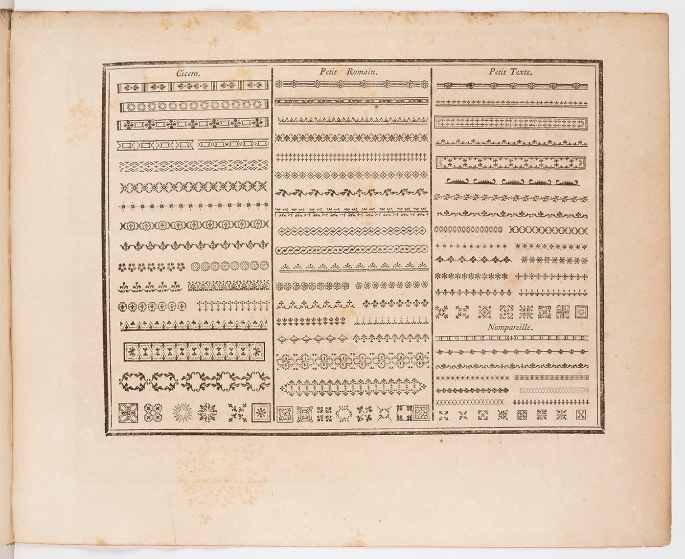
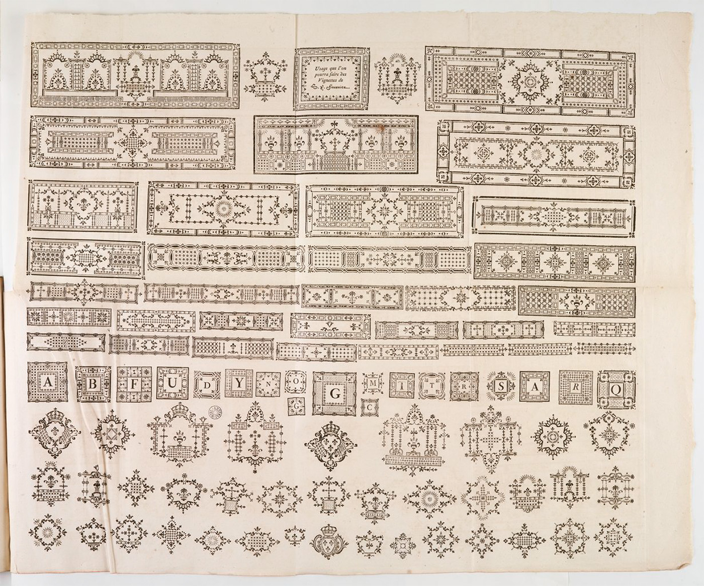
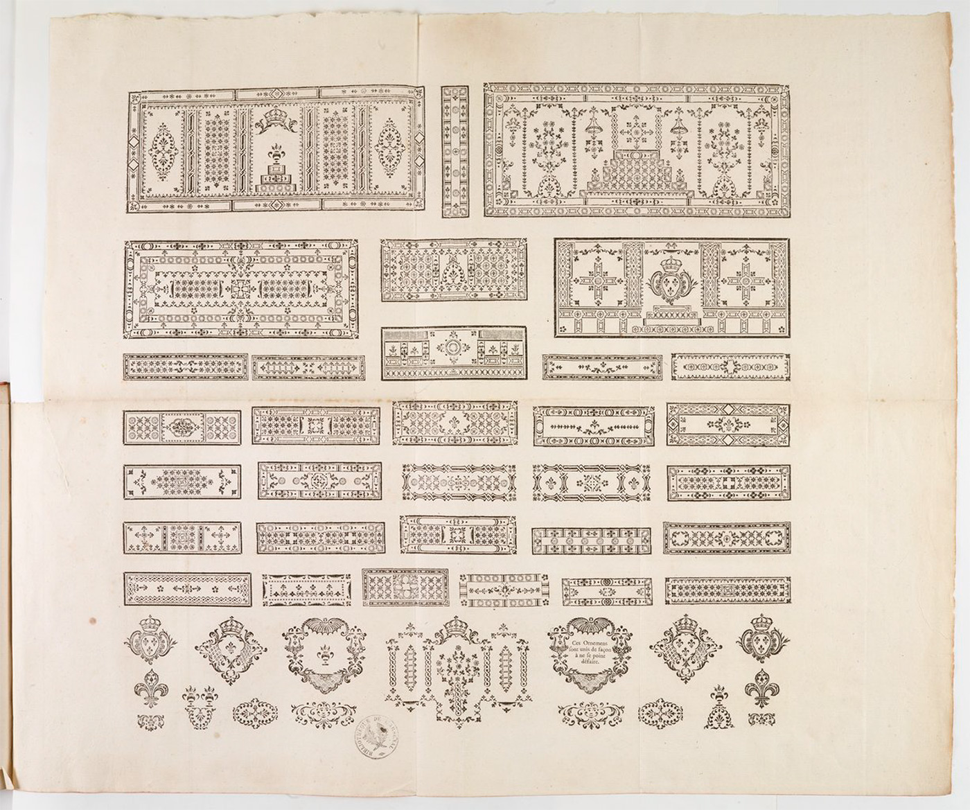
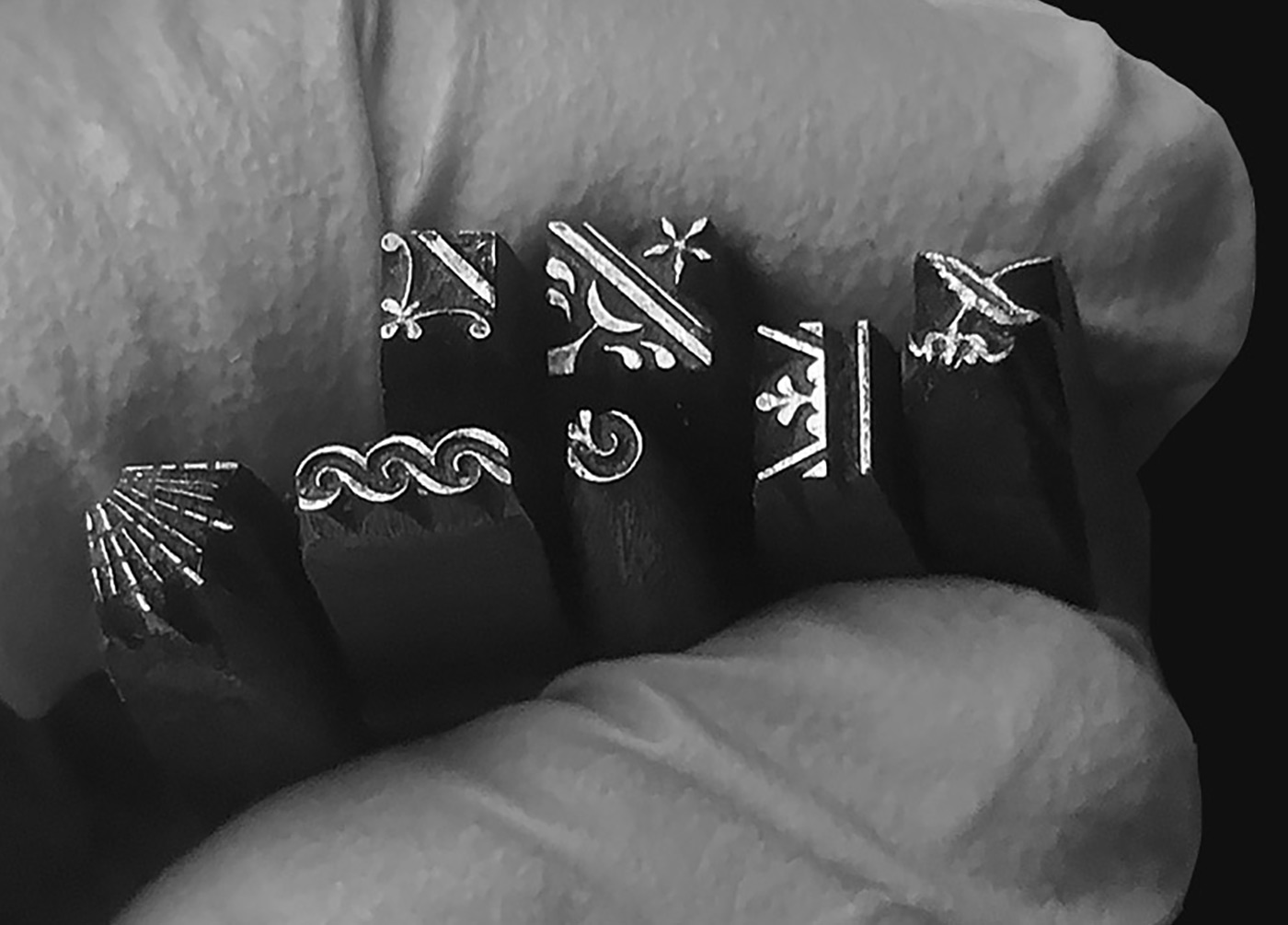
MODÉLESE DES CARACTERES DE L’IPRIMERIE
PIERRE-SIMON FOURNIER, FRANCIA [1712-1768]
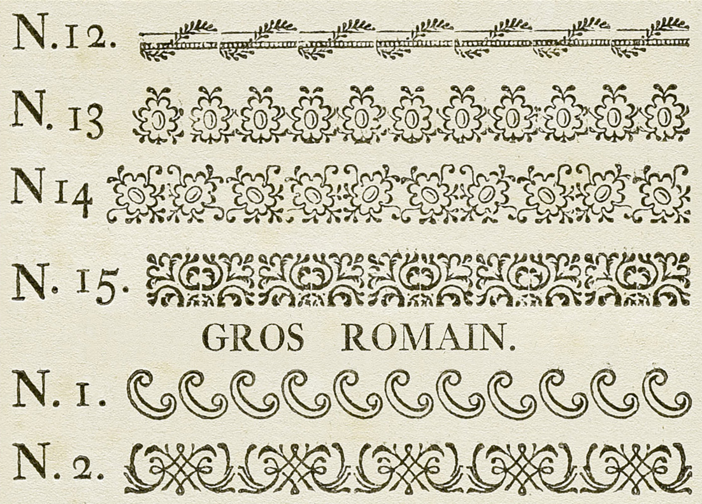
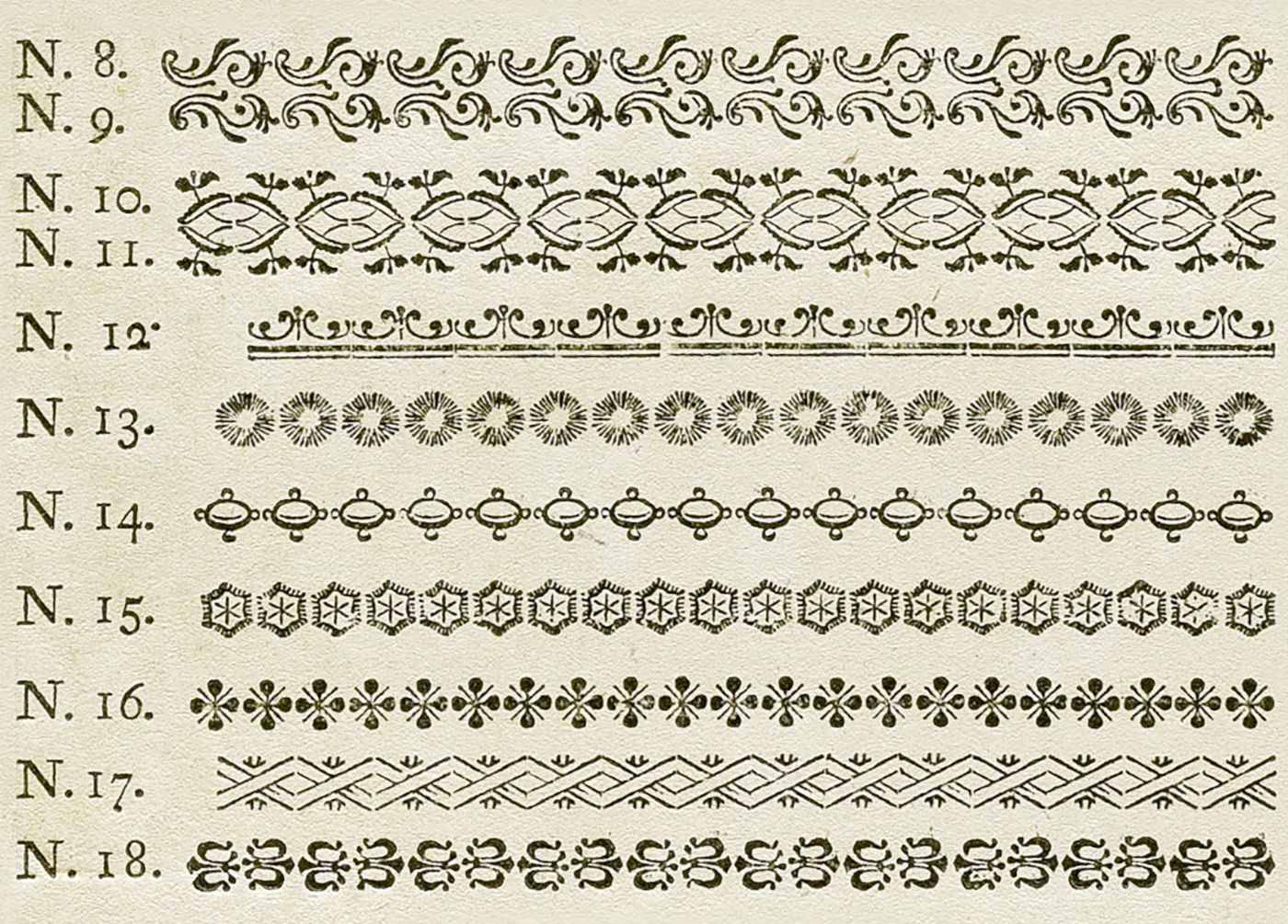
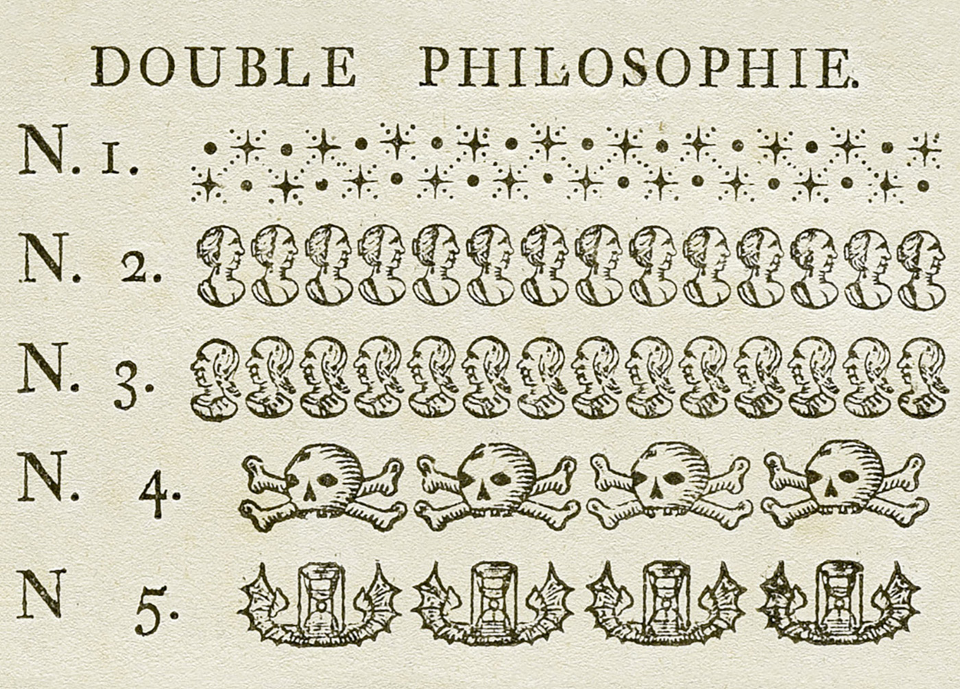
Fue un grabador y fundidor de tipos francés particularmente notable por la ornamentación tipográfica. Publicó un Manual tipográfico (Manuel typographique), del cual hubo dos volúmenes en 1764 y 1766. Ambos volúmenes son una de las mayores fuentes de los procesos de elaboración de tipos en la era de la prensa, además de tener ejemplos de los tipos y ornamentaciones que Fournier utilizaba en su taller. El aporte de Fournier es significativo en la ornamentación en sus tipos. Empezó a grabar bloques ornamentados en madera. Después cambió el material por láminas de hierro. Su primer tipo grabado fue el gros-canon en 1736. Considerado más como del Rococó que como Neoclásico por su tipografía ornamental, muchos diseñadores copiaron los tipos de Pierre-Simon Fournier porque sus trabajos eran de los más destacados y los más legibles en ese tiempo.
La familia Fournier fue de hecho, junto con la de los Didot, la familia más importante de impresores-editores del siglo XVIII. Por la alta calidad del papel, por la extrema precisión en la revisión de los textos, por la elegancia de los caracteres, las ediciones producidas por estas familias anticipan las de Giovanni Battista Bodoni.
La familia Fournier fue de hecho, junto con la de los Didot, la familia más importante de impresores-editores del siglo XVIII. Por la alta calidad del papel, por la extrema precisión en la revisión de los textos, por la elegancia de los caracteres, las ediciones producidas por estas familias anticipan las de Giovanni Battista Bodoni.
003
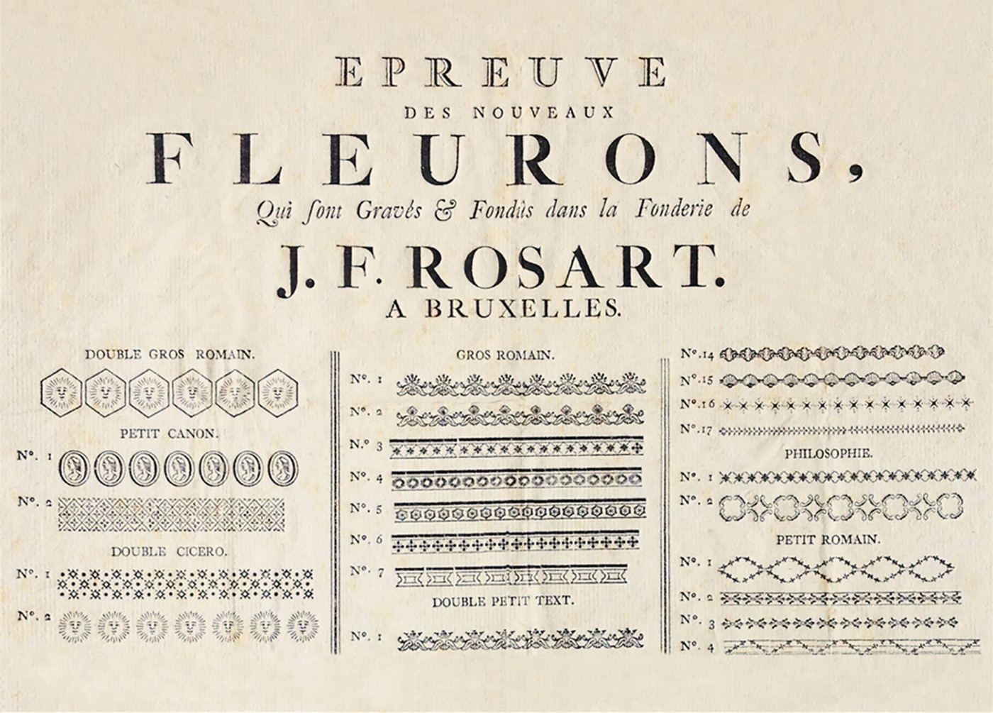
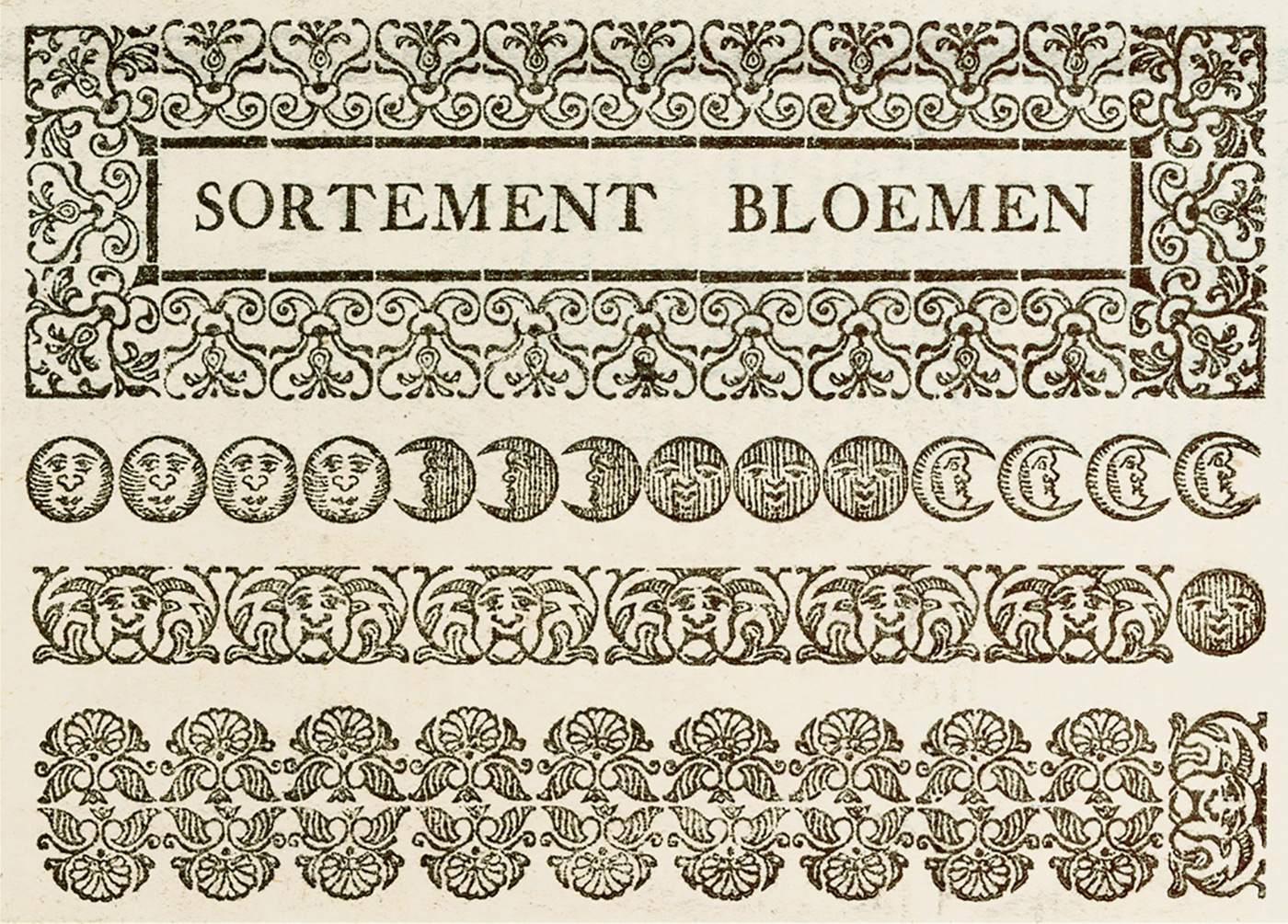
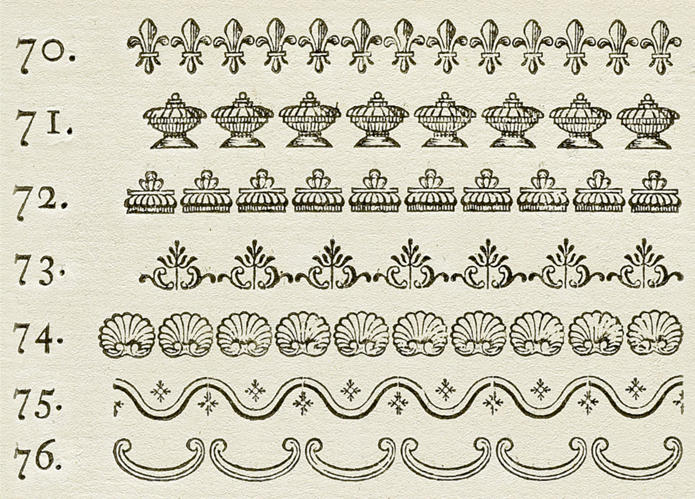
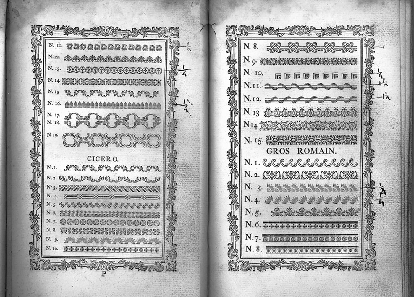
THE TYPE SPECIMEN
JACQUES FRANÇOIS ROSART, BELGIAN [1714-1777]
Belgian punchcutter and typefounder (b. Namur, 1714, d. Brussels, 1777). His early life was spent in Namur, Belgium. In 1740, he started out in Haarlem as a punchcutter, and published twelve type specimens in 1741, as well as 14 ornaments. From 1746 until 1752, he cut another thirteen different alphabets. In 1749, he cut several sets of musical characters. He had a contract with Enschedé, where he made the gorgeous shaded capital typeface Rosart in 1759, aka Enschedé no. 811. He moved back to Brussels in 1759 where he ran his own foundry. He published books with specimens in 1752, 1761 and 1768. F. Baudin and N. Hoeflake published The Type Specimen of J.F. Rosart, Brussels, 1768 (Amsterdam, London, New York, 1973). The original book by Rosart.
Students at the Plantin Institute of Typography in Antwerp documented their research of the 18th-century Belgian punchcutter Jacques-François Rosart and turned it into a website called The Rosart Project.
Students at the Plantin Institute of Typography in Antwerp documented their research of the 18th-century Belgian punchcutter Jacques-François Rosart and turned it into a website called The Rosart Project.
004
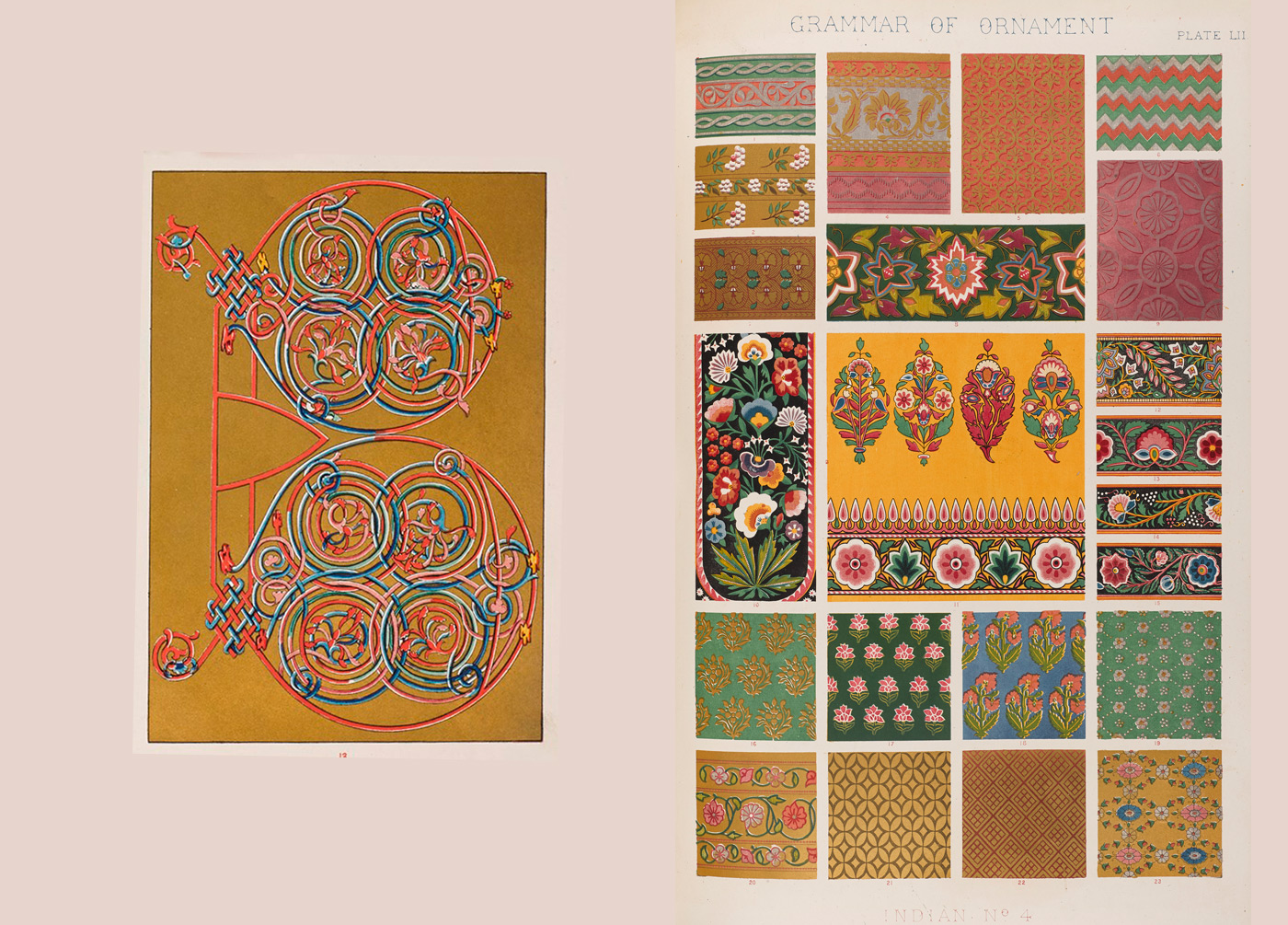
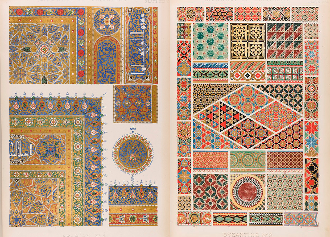
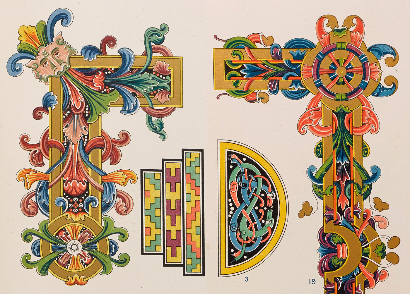
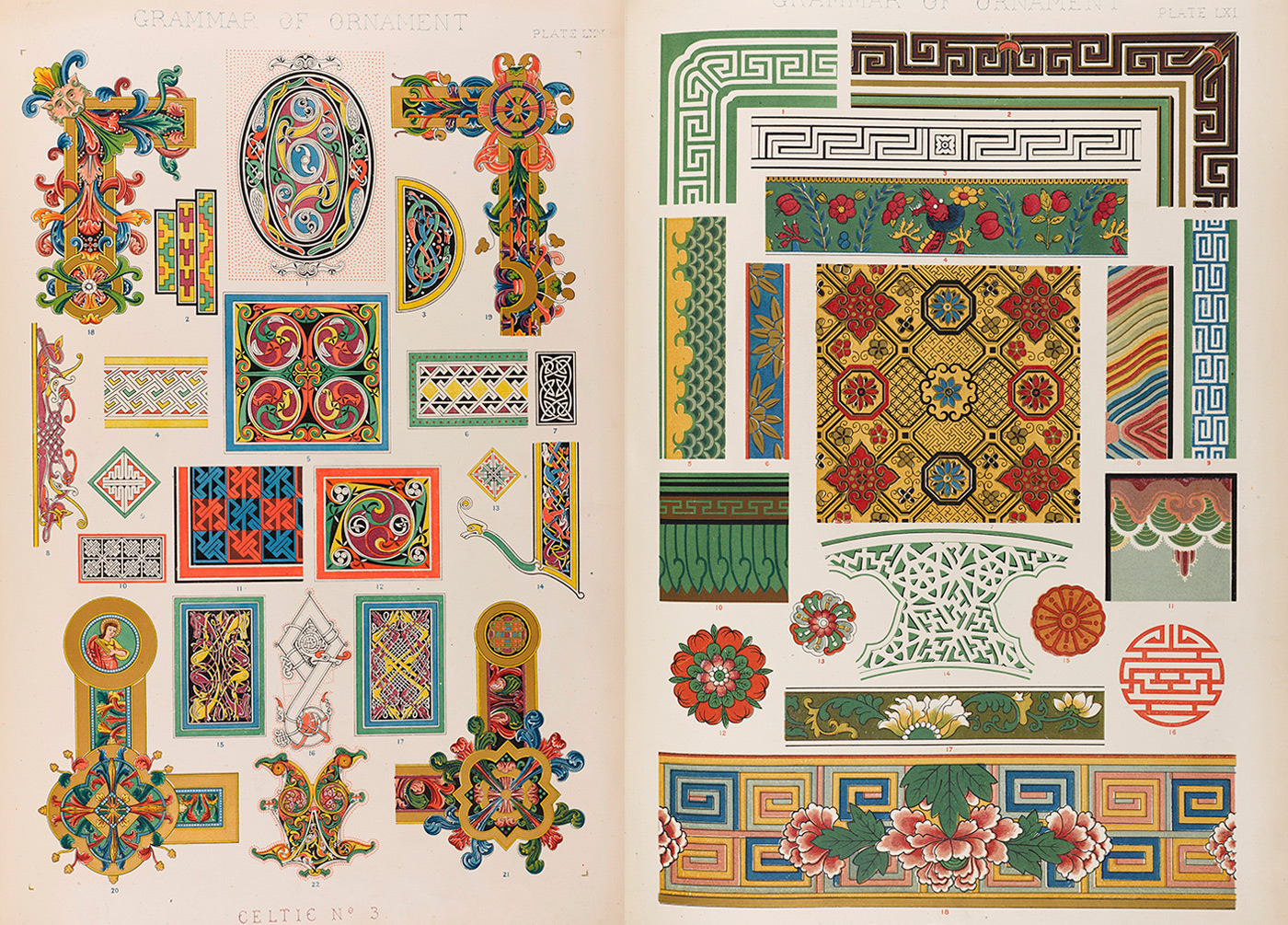
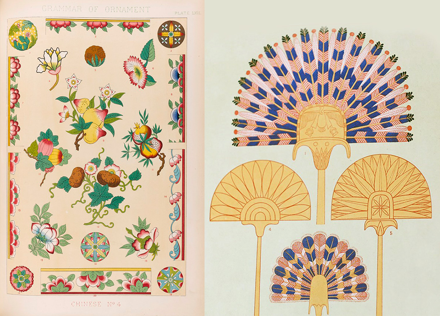
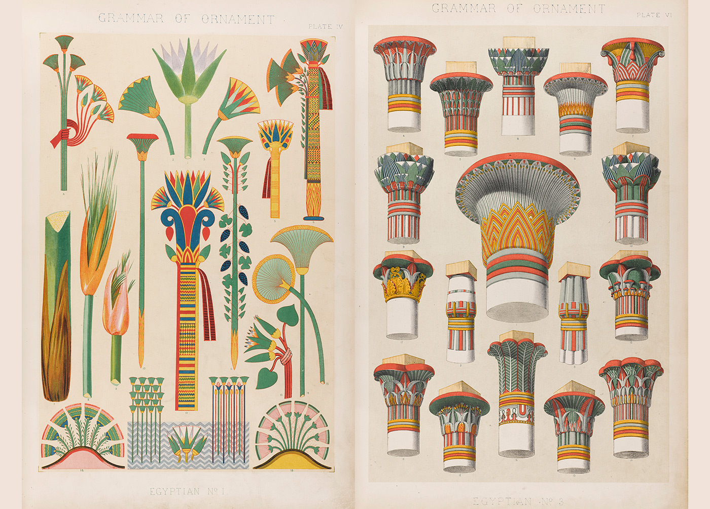
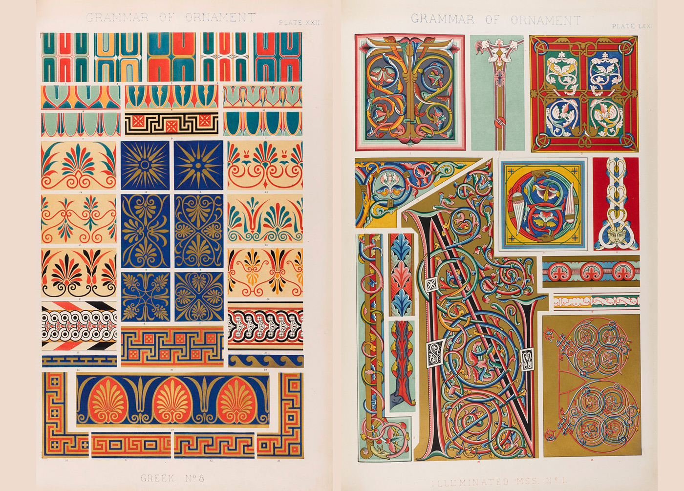
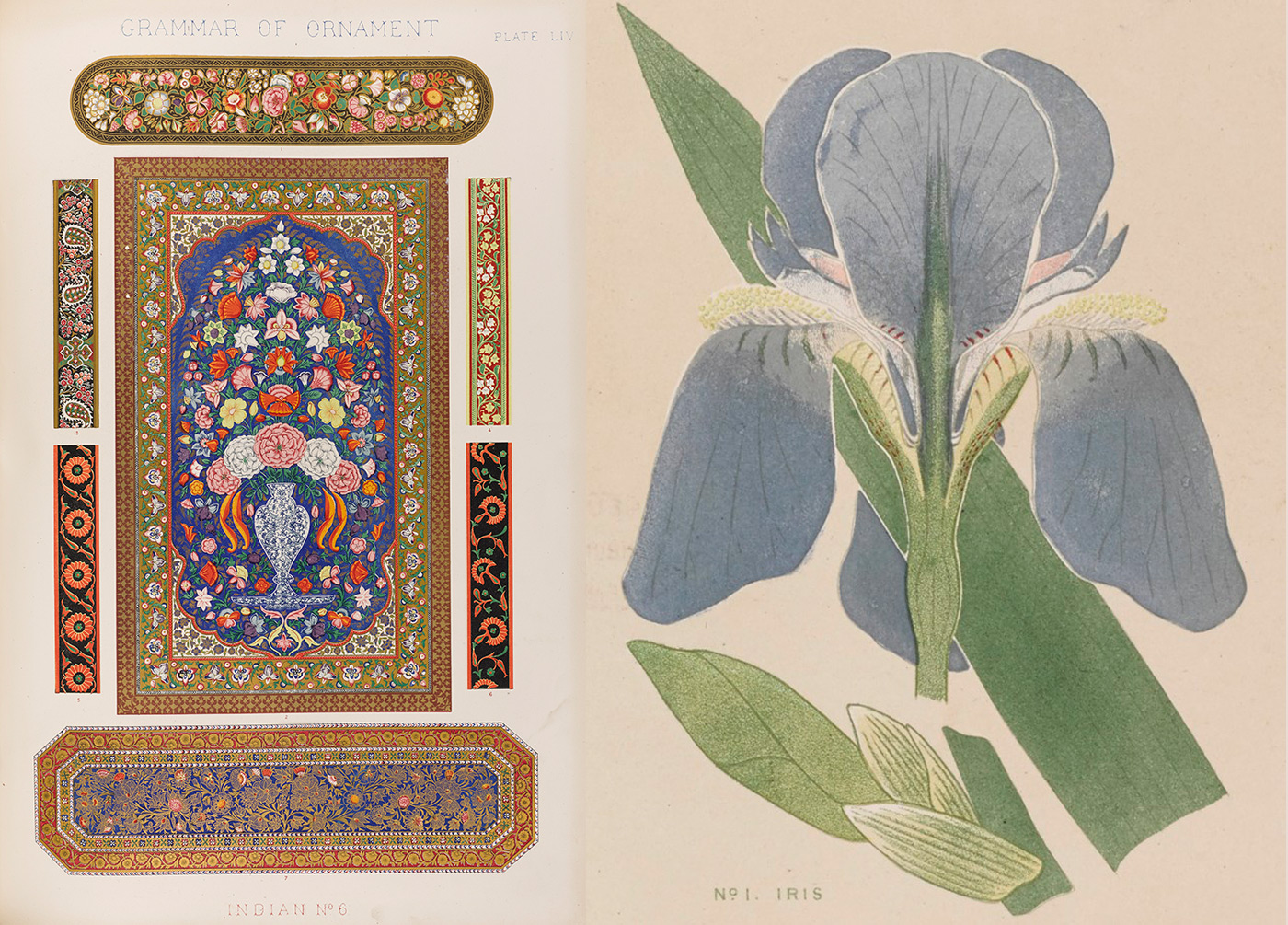
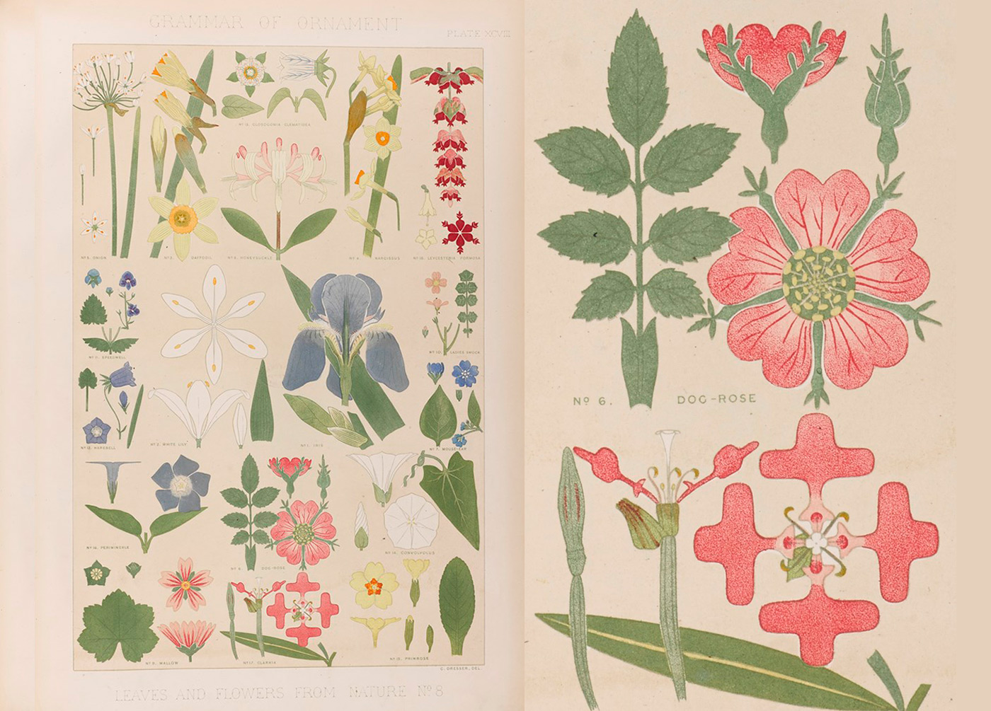
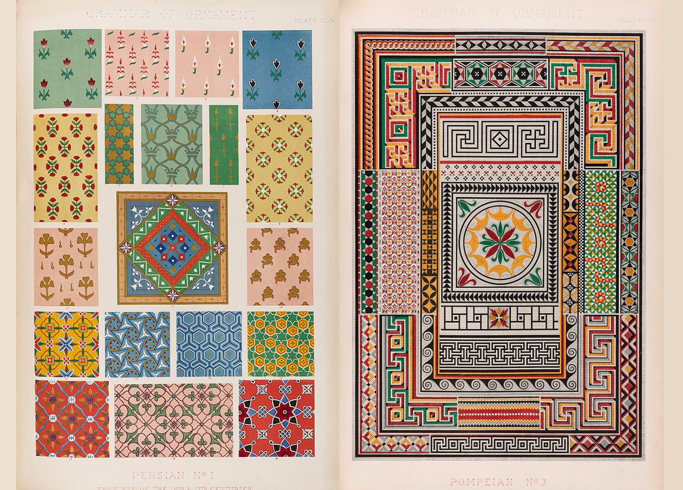
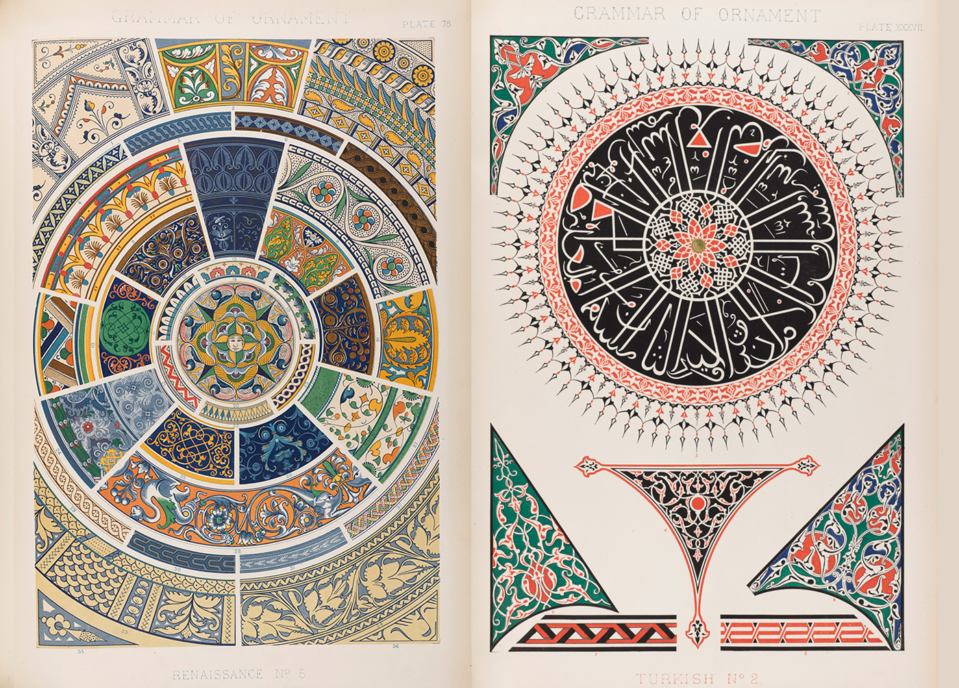
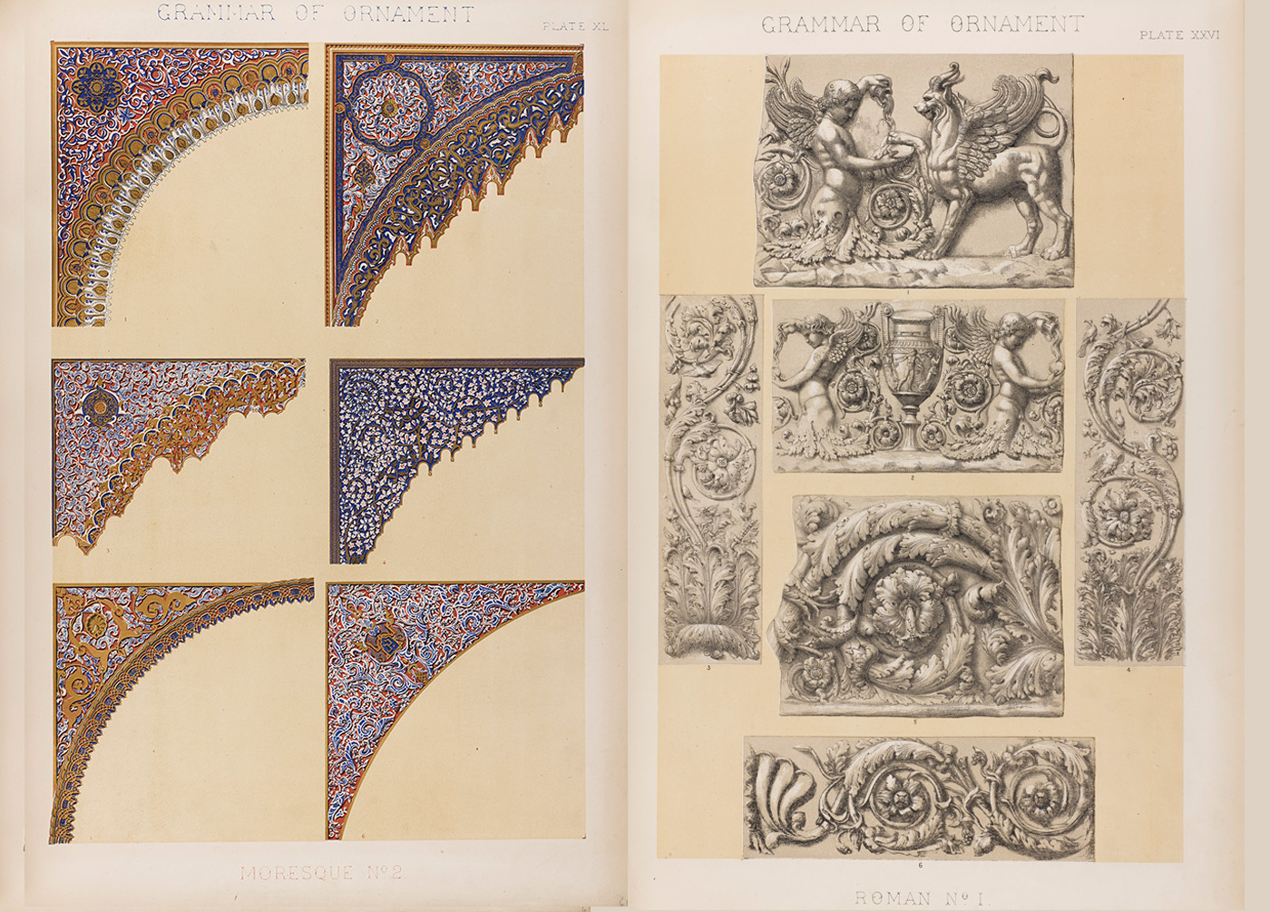
LA GRAMÁTICA DEL ORNAMENTO
OWEN JONES, INGLATERRA [1809-1874]
Owen Jones was one of the most influential tastemakers of the Victorian era. His pioneering studies on colour theory, geometry and form still inspire designers to this day.
Trained as an architect, designer and design theorist, Jones’ greatest project was perhaps as Superintendent of Works for the 1851 Great Exhibition. A celebration of the power and potential of new industrial technologies and modern design, Jones' work on the interiors of the Crystal Palace showcased his skills to six million visitors. Ironwork decorated in bold primary tones – vivid reds, yellows and blues – nodded to the Alhambra and Ancient Greece, motifs which surfaced in Jones’ work time and time again.
Grammar of Ornament was Owen Jones’ design masterpiece. First published in 1856, the lavish folio highlighted stunning patterns, motifs and ornaments in 112 illustrated plates. Each intricate illustration explored design principles behind the architecture, textiles, manuscripts and decorative arts of 19 diverse cultural periods, with a final chapter revelling in the glory of the natural world. Grammar of Ornament was a monumental publishing project that achieved standards of colour printing never seen before. It is still in print 150 years later, testament to its enduring design appeal.
Grammar of Ornament was Owen Jones’ design masterpiece. First published in 1856, the lavish folio highlighted stunning patterns, motifs and ornaments in 112 illustrated plates. Each intricate illustration explored design principles behind the architecture, textiles, manuscripts and decorative arts of 19 diverse cultural periods, with a final chapter revelling in the glory of the natural world. Grammar of Ornament was a monumental publishing project that achieved standards of colour printing never seen before. It is still in print 150 years later, testament to its enduring design appeal.
005
HISTOIRE DE L'ÉCRITURE TYPOGRAPHIQUE : LE XIXE SIÈCLE FRANÇAIS
JACQUES ANDRÉ & CHRISTIAN LAUCOU
006
SUPER TIPO VELOZ
JOAN TROCHUT, ESPAÑA [1942]
Supertipo Veloz, the typographic system developed by Joan Trochut in 1942, was a collection of modular forms which could easily be combined into typographic, pictorial or decorative elements. The period following the Spanish Civil War starved small-scale printers of the ability to easily create images. Joan developed the Veloz system to address this problem in order enliven jobbing printing. This talk discusses the history of its creation as well as the bigger context behind this fascinating and relatively unknown system. This modular system was digitalized and revived by Andreu Balius and Àlex Trochut in 2004.
007
THE KABA ORNAMENT
BRAM DE DOES, HOLANDA [1934]
Bram de Does was born 1934 in Amsterdam He studied asymmetrical typography in the 1950’s at the Amsterdam Graphic school.
Bram de Does started working on the Kaba ornaments in the 1960's after completionof the two typefaces Trinity and Lexicon.
Bram was asked to design a series of ornaments to be used by the company Enschedé, as security printing on legal bank documents, but primarily as a book designer.
Bram de Does chose to create the Kaba, ornaments in old traditional way of printing by hand, and in that way you can say he is making a protest to the digital world. Kaba is the Arabic word for cube, and it’s also the name of the holy cube in Mecca.
Bram de Does expressed that he found working with the ornaments meditative Bram had great talents in math and the understanding of complex systems, which is maybe the reason for the structure of the Kaba ornaments, and why he felt free working with it, compared to working with typography.